All things come to an end, especially bubbles.
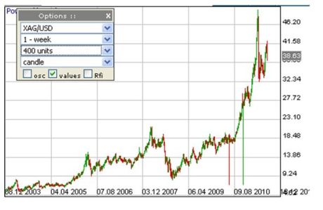
Below the schematic representation of the way bubbles develop and deflate and what phases they go through. Below it, a graph showing the rise and rise of silver during the last 8 years in a weekly graph of the price of the stuff in dollars per troy ounce. And for those who did not put two and two together, the graphs combined in the bottom graph.

 The top we have had, denial we have heard and the bull trap ran its course. We are now returning to “normal”, meaning going back to the new “paradigm” we’ve established, that is: “Silver is not overpriced, it should be this expensive, the world has changed, this time it is different, we will never go back to the era of cheap silver, etc.”
But during the next slump this certainty will turn to fear, fear to capitulation, capitulation to despair.
I am sharpening my knives to ride this snake.. (That’s a disclaimer, I am not holding a position in silver at the moment.)

Great article! Except that silver is currently just entering the awareness phase….
Silver is not in a bubble … public debt is. This is most ridiculous chart i have ever seen. Thanks for sharing.
See that “greed” “denial” “bull trap”….it should actually be labeled “bear trap”
I think you are kind of correct in your thinking, only you are misplaced on the current position on the chart. this might help..
sorry, this chart, it wouldnt let me insert the image
I would love to see $10 silver, but it ain’t gonna happen…
PM prices are a reflection of larger macro-economic trends. Some of these trends are irreversible, such as the shift in economic power from west to east. With the euro project being almost in ruins and treasuries no longer the de facto safe haven asset, I don’t see how PM’s will not continue to rally. Buying comes from a large part from the retail crowd, small investors who desire something tangible. This is particularly true in Asia. They buy the physical metal and are not leveraged. Institutional investors are still underrepresented in precious metals compared to other assets classes such as equities and bonds. They too will eventually want to own some assets without counterparty risk…
Fact of the matter is that Asian demand for gold and silver (both official and public) is soaring and with their increasing purchasing power they will continue to purchase more and more precious metals.
This guarantees a virtual floor for every large spike downwards.
Reality trumps technical analysis in this case. Though I am not sure this even qualifies as technical analysis. In fact, I am sure it doesn’t. More like “opinion with a couple of charts”.
Anyway we’ll see, won’t we?
The comments confirm my point of view.
They believe in a paradigm shift, they believe that it will be different this time and the peak is exactly then when all people are bullish.
No such thing, Indians and Chinese will prove to be as apt miners as westerners are.
Technology grows faster then resources shrink.
First comment says it all. Also the mania phase upwards trend needs to be extended about 10-100 times. Then we’d be coming close to what the silver story really is.
assume the writer is youthful, maybe late 20’s or early 30’s… no econ degree.
upon reaching middle age, the wisdom of being wrong countless times will set in. the realization of opportunity lost will haunt you while you suck coin out of your sofa to buy your grandbabies an ice cream cone.
OK Victor, this is why you are wrong.
First of all, silver & gold are not going up to infinity. What is happening is the decline of the dollar.
Put up a chart of the Dow Jones. Is that in a bubble too? In 1965, it was at less than 1K, IIRC.
Now, goods are priced relatively to each other. The Dow and Silver are both priced in dollars, but you could price the Dow in Gold or Silver.
http://home.earthlink.net/~intelligentbear/com-dow-au.htm (Gold)
http://www.investorvillage.com/smbd.asp?mb=144&mid=9424059&pt=msg (Silver)
You see Victor? Nothing is different this time. You are just using the wrong charts to make the wrong point.
Any paper or stock is quite capable of going to zero. Horse drawn carriage companies pretty much did. Enron did. Think of the United States as a giant ENRON and think of the dollar as this giant ENRON’s stock. What is the price of gold or silver today relative to a share of ENRON stock?
You following me?
O…K…but how do you fit in ;
– the GROSS manipulation of silver carried on by the central banks.
– the margins raised many times by the CME.
– total ignoring by the CFTC with all the games being played and manipulation.
– the fact that there is very little of physical – just look at how every other commodity is performing compared to silver- alarming.
– both physicists and geologists are stating that silver will be extinct in less than 10 years .
Maybe it would be a wise move to just stack and hold !